Memory Game: Matching Pair
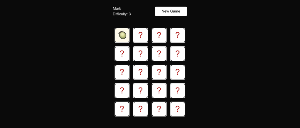
Live Site: https://matchingpair.markluigibatoctoy.com
What I Learned
Building this Matching Pair game helped me strengthen my full-stack development skills using ReactJS, Next.js, and Laravel. I learned how to structure a game-based application with a clear lifecycle—from session creation to gameplay and final result handling.
On the frontend, I improved my understanding of state management, component re-rendering, and game logic handling in React. Managing flipped cards, preventing invalid clicks, tracking moves, and detecting win conditions required careful control of state and timing.
On the backend, I reinforced best practices in API design and session management using Laravel. Creating clean endpoints for session creation and game result storage made the application more structured and scalable.
This project helped me think more architecturally—separating UI logic, business logic, and persistence properly.
What I Worked On
Session Creation
- Built a Laravel API endpoint to create and initialize a new game session.
- Stored session metadata such as start time and game configuration.
- Connected the Next.js frontend to the backend via REST APIs.
Game Logic (React / Next.js)
- Implemented dynamic card shuffling and matching logic.
- Managed card states (flipped, matched, locked).
- Tracked player moves and game progress in real time.
- Prevented rapid clicks and invalid state updates.
- Detected win conditions once all pairs were matched.
Game Over / Result Page
- Displayed final statistics such as total moves and completion status.
- Sent the completed game data to the Laravel backend for storage.
- Structured routing between create session → game → result page using Next.js.
Key Takeaways
- Clean architecture improves scalability – Separating frontend interaction from backend persistence makes the system easier to maintain and expand.
- State control is crucial in interactive apps – Small mistakes in state handling can break game logic.
- Planning the flow first saves time – Defining the full lifecycle (create → play → save result) before coding reduced rework.
- API-first thinking improves structure – Designing backend endpoints early made frontend integration smoother.
Client-First Template 5
Figma Design: https://www.figma.com/community/file/1023922334417784348/client-first-template-5
Live Site: https://finsweet5.markluigibatoctoy.com/
What I Learned
This week, I explored Finsweet’s Client-First system through Template 5 on Figma. I learned how Client-First simplifies the design-to-development workflow by focusing on clear naming conventions, organized structure, and scalable components.
The style guide within the template was especially helpful—it provided ready-to-use typography, spacing, and layout systems that made the project feel structured right from the start. I realized how much time can be saved when everything is labeled logically instead of starting from scratch or dealing with messy class names.
What I Worked On
I started by customizing Client-First Template 5 in Figma for a project. The goal was to keep everything consistent and easy to maintain:
- I organized the design into sections like headers, content blocks, and footers.
- I followed the Client-First naming system to ensure a smooth transition when moving the design into Webflow.
- I used the predefined styles for typography and spacing so the design stayed consistent across pages.
Once the design was finalized, I handed it off for Webflow development with confidence, knowing the structure would be easy to follow and scalable for future updates.
Key Takeaways
- Clarity saves time: Logical naming conventions prevent confusion later in the process.
- Design systems matter: A prebuilt system like Client-First keeps everything consistent and professional.
- Smooth handoff: When the design is organized well in Figma, the development phase becomes much faster and less error-prone.
Client-First Template 1
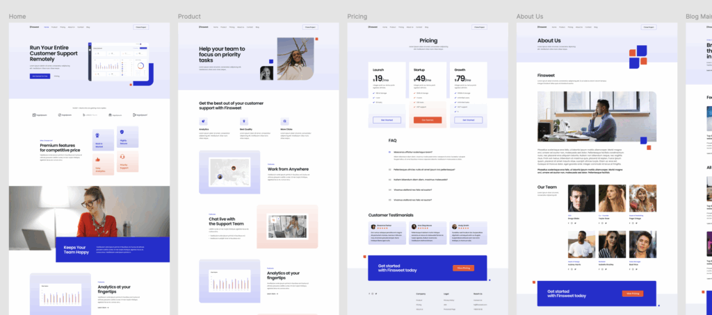
Figma Design: https://www.figma.com/community/file/1020702273348701758/client-first-template-1
Live Site: https://finsweet1.markluigibatoctoy.com/
I recently explored Finsweet’s Client-First template and applied it to a live build—creating a polished, scalable site with 10+ pages (including Home, Product, Pricing, About, Blog, and more). This exercise deepened my understanding of organized Webflow development, and it sharpened my workflow. Below, I’ll walk through what I learned and what I worked on, highlighting key insights for anyone interested in structured Webflow builds.
What I Learned
1. The Client-First Approach
The Client-First system focuses on building websites that are clear, scalable, and easy to maintain. The structure is designed so that any designer, developer, or client can quickly understand and manage the project.
2. Clear and Organized Structure
Every page follows a consistent layout framework, making it easy to keep designs aligned and visually balanced. This consistent structure also helps when scaling up to larger projects.
3. Consistency in Design
Typography, spacing, and colors are applied using a predefined style system. This ensures every element feels part of the same design family, improving both the visual quality and the user experience.
4. Responsive Design Best Practices
The template is built with responsiveness in mind, so layouts adapt beautifully across desktop, tablet, and mobile devices. I gained a better understanding of how to manage spacing, stacking, and scaling for different screen sizes.
5. Project Organization
The system organizes content in a way that makes it easy to navigate the project. This not only saves time but also helps ensure that updates and changes can be made quickly without affecting other areas of the site.
6. Accessibility and Readability
By following best practices for sizing and spacing, the design remains easy to read and navigate for all users, which is an important part of creating inclusive websites.
What I Worked On
1. Setting Up the Template
I started by familiarizing myself with the template’s structure and layout system, understanding how the sections, containers, and spacing were applied throughout the pages.
2. Building Core Sections
I customized the home page, creating a strong hero section, feature highlights, and call-to-action areas that clearly communicate the brand’s value.
3. Ensuring Consistent Styling
I applied the template’s style rules across all sections, ensuring the same design language was maintained from page to page.
4. Making It Responsive
I refined the layout for mobile and tablet views, ensuring that the design remained visually appealing and easy to navigate on all devices.
5. Organizing the Project
I kept the project well-structured so that any future updates—whether adding a new section or adjusting a design element could be done smoothly.
6. Creating the Blog Layout
I built and styled the blog listing and individual post pages, keeping the look and feel consistent with the rest of the site while maintaining a clear reading experience.
Key Takeaways
- A well-structured template saves significant time during development.
- Consistency in design creates a better user experience.
- Organized workflows make projects easier to maintain in the long term.
- Responsive design principles are essential for modern web projects.
Client-First Template 2
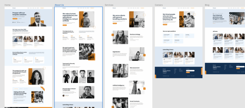
Figma Design: https://www.figma.com/community/file/1020702672948793919/client-first-template-2
Live Site: https://finsweet2.markluigibatoctoy.com/
For this portfolio project, I chose to work with the Client-First Template 2 by Finsweet, available on the Figma Community. The template is based on the Client-First naming convention for Webflow, but I used it as a reference to build a fully responsive website using my own front-end development stack.
This project allowed me to practice converting a Figma design into a pixel-perfect, responsive web page, sharpen my CSS structuring, and improve my overall approach to scalable and maintainable UI development.
What I Worked On
- Design Conversion: I translated the full Figma design into clean, semantic HTML and modern CSS (with Tailwind CSS).
- Responsive Layouts: I made the layout responsive across multiple breakpoints (mobile, tablet, and desktop) by using Flexbox, Grid, and media queries effectively.
- Component-Based Structure: I broke down the UI into reusable components (hero, features, CTA, footer, etc.) to keep the codebase modular and organized.
- Typography and Spacing: I closely followed the design system from the Figma file, maintaining consistent paddings, font sizes, and line heights.
- Accessibility Considerations: I used proper heading structures, semantic tags, and contrast ratios to ensure a more accessible web experience.
What I Learned
- Client-First Naming System: Although it’s built for Webflow, I adapted the class naming strategy to keep my HTML structured and easy to read. It helped me think in a more systematic way when organizing my markup.
- Design Interpretation: Translating static designs into code helped me improve my attention to detail—like spacing, alignment, and interactive states.
- Efficiency with Tailwind CSS: I got more comfortable using Tailwind utility classes and learned how to extend them to fit custom design needs.
- Working with Figma Files: I gained more experience navigating Figma by inspecting layers, extracting assets, understanding constraints, and adapting design decisions when necessary.
- Mobile-First Development: I refined my approach to mobile-first development by starting with small screens and scaling up, ensuring better performance and maintainability.