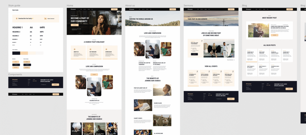
Client-First Template 10 – Church
Figma Design: https://www.figma.com/community/file/1068172976080193544
Live Site: https://finsweet10.markluigibatoctoy.com/
This project is a fully responsive website built from a Figma design titled “Client First Template 10 — Church & Community.” The design focuses on clean layouts, purposeful spacing, strong visual hierarchy, and clear messaging. These are all important aspects of websites intended for community organizations and non-profits.
The goal of this project was to accurately translate the design into a working website, paying close attention to detail, alignment, typography, and responsiveness across various screen sizes. I approached the build with semantic HTML and Tailwind CSS, ensuring the code was not only maintainable but also accessible.
What I Worked On
- Recreated the entire layout from scratch based on the Figma file
- Structured HTML with semantic tags for better accessibility and SEO
- Styled every section using Tailwind CSS, leveraging utility classes for spacing, grids, and responsive behavior
- Ensured pixel-perfect responsiveness for mobile, tablet, and desktop views
- Paid close attention to visual balance, typography rhythm, and image presentation
What I Learned
This project gave me a chance to practice interpreting static design files and turning them into live, responsive experiences. It reinforced my skills in structuring clean, readable code and organizing components in a scalable way using Tailwind’s utility-first approach. It also helped me refine my workflow when working from Figma. From analyzing spacing and typography to making real-time decisions about breakpoints, padding, and layout structure.
Overall, it was a rewarding exercise that not only sharpened my technical skills but also strengthened my eye for detail and design implementation.
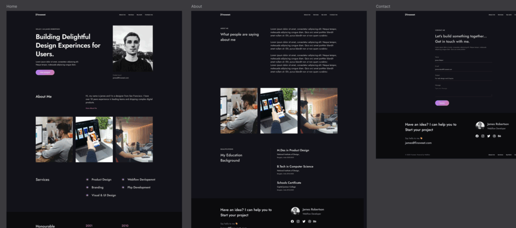
Client-First Template 4
Figma Design: https://www.figma.com/design/zoyUrEb1RQZE3cT2i4QfF9/Client-First-Template-4–Community-?node-id=0-1&p=f&t=Q0zgla5fq4KVx6tJ-0
Live Site: https://finsweet4.markluigibatoctoy.com/
This project is part of my ongoing journey to sharpen my front-end development skills through real-world practice. I took this Figma design and transformed it into a responsive, clean-coded website using HTML, Tailwind CSS, and best practices in layout structure.
What I Worked On:
- Converted the full Figma layout into a responsive and pixel-perfect website
- Implemented Tailwind utility classes to create flexible and maintainable styles
- Built reusable components like buttons, cards, and newsletter forms
- Handled layout challenges across breakpoints using mobile-first design
- Structured the HTML to be semantic and accessible
- Optimized spacing and typography to closely match the Figma design
What I Learned:
- How to better organize and reuse Tailwind classes for cleaner code
- How to manage spacing and scale more consistently using utility-first principles
- Improved my responsiveness workflow, especially on content-heavy sections
- Gained a better eye for detail like matching fonts, colors, and layout spacing more accurately
- Reinforced the value of building with accessibility and readability in mind